Functions and graphs: Data and graphs
 Data graphs
Measurement data is often collected about observable phenomena, sometimes by conducting an experiment and sometimes by measurements in nature. These measurement results are often put in a table in which simultaneous measurements of physical quantities are listed row by row. Each measurement of two quantities in such a table, say \(x\) for the quantity \(X\) and \(y\) for the quantity \(Y\), can be seen as a couple \((x,y)\) and understood as the point in the plane with horizontal axis belonging to \(X\) and vertical axis belonging at \(Y\). If there are several points, a scatter plot of \(Y\) plotted against \(X\) is constructed. Also, successive points are often interconnected with a straight line segment to get a line graph.
You can do the same with a function \(f\) with a given function rule. Each number \(x\) is associated with a function value \(y\) determined by \(y=f(x)\). If you see the \(x\) and \(y\) as a couple \((x,y)\), you can also see this as a point in the \(y\)-\(x\) plane. If you draw several points and connect consecutive points with increasing values of \(x\) by straight segments (or even more daringly by curved segments) you get the graph of the function \(f\).
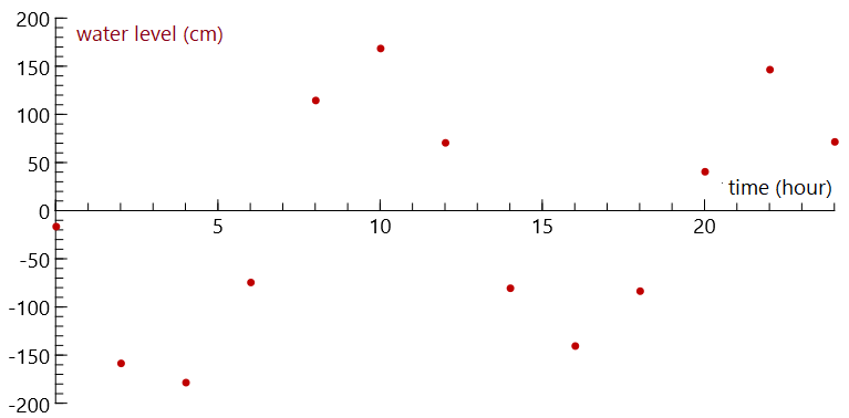
Tide at Vlissingen on May 21, 2006 Below you see the measured water levels at Vlissingen on May 21, 2006 from midnight and with time intervals of two hours. \[\begin{array}{|r|r|r|r|r|r|r|r|r|r|r|r|r|r|}\hline \text{time}&0&2&4&6&8&10&12&14&16&18&20&22&24\\ \hline
\text{level (cm)}&-16&-158&-178&-74&115&169&71&-80&-140&-83&41&147&72\\ \hline\end{array}\] In the point graph you draw a coordinate system for the water level-time plane and put for each time value a thick dot on the point with the coordinates of the given time and the corresponding water level. In this example, you get the graph below.
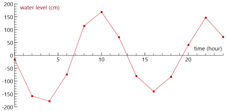
In a line graph of the data, you draw straight lines between the data points:
At few measuring points the line graph is angular, but at time intervals of half an hour this graph becomes smoother:
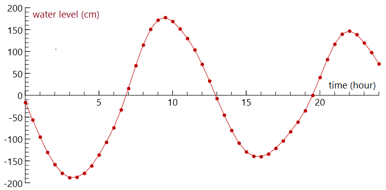
In the figure below, the graph of the relation \[\mathrm{water level}=-11+161\sin\bigl(\tfrac{1}{4}\mathrm{time}+3\bigr)+25\sin\bigl(\tfrac{1}{2}\mathrm{time}-\tfrac{3}{2}\bigr)\] is drawn in blue for 2000 points on the interval \([0,24]\) together with the red dot graph of the measurement data. The graph of the function is a smooth curve that fits the measurement data quite well, i.e., yields function values for the measured times that are close to the measured water levels. That is why we speak of a fit of the data.
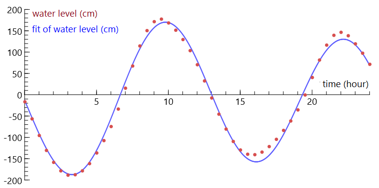
You can describe the course of the graph of the function with words such as rising, falling, maximum and minimum. For example, on May 21, 2006, the highest water level in Vlissingen was reached at high tide at around ten o'clock in the morning and ten o'clock in the evening.


