Doing mathematics with R: Graphs of functions
 Graphs with ggplot2
The ggplot2 package is intended for data visualisation, but it can of course also be used for graphing functions. There is no universal classification for data visualization, but among graphs, maps, diagrams, etc., a graph is the most structured form. Specifically, we can divide a graph into the following three essential components:
data: the data collection consisting of certain variables that we want to graph.geom: The geometric object in question. This refers to graphical primitives that we can use in the graph, such as points, lines, bars, etc.aes: aesthetic ('aes-thetic') attribute of the geometric object that we can add to the graph. For example, \(x,y\) position, colour, shape and size. Each assigned attribute can be assigned to a variable in our dataset. If they are not assigned to variables, their default values apply.
Other components in a graph that we can check include
- sections that divide a graph into subgraphs;
- statistical transformations such as aggregating to values in a histogram;
- coordinate systems (e.g., rectangular or spherical coordinates);
- scales that determine how the data in a graph is linked to an appearance. To change the link, you use custom scales. This can include scaling of the coordinate axes, but also colouring, padding, shape and size;
- position adjustments;
- labels and legend.
First of all, the ggplot2 package must be installed with all dependent packages included and then it can be made available in a session as follows:
> library("ggplot2")
Need help getting started? Try the cookbook for R:
http://www.cookbook-r.com/Graphs/
Of course it makes sense to look at the examples on the website http://www.cookbook-r.com/Graphs/ or even better consult the website https://ggplot2.tidyverse.org/ .
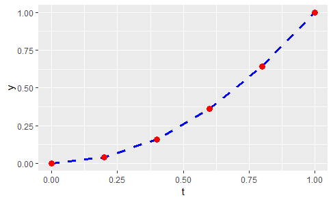
In the first example, we use graphing primitives to create a simple graph of points connected by dotted lines. The R script
library("ggplot2")t <- seq(from=0, to=1, by=0.2)
y <- t^2
dataset <- data.frame(t, y)
fig <- ggplot(data=dataset, aes(t,y)) +geom_line(color = "blue", linetype = "dashed", size = 1.25) +
geom_point(color = "red", shape = 16, size = 3)
print(fig)
yields the following figure:

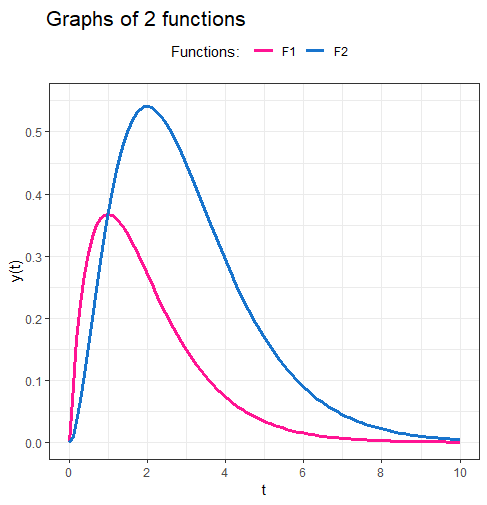
In the second example we illustrate how graphs of two functions can be combined into one figure. To graph functions, we use in the R script below the stat_function function and no graph primitives.
library("ggplot2")
F1  <- function(t) { t * exp(-t) }
F2  <- function(t) { t^2 * exp(-t) }
fig <- ggplot(data.frame(x = c(0, 10)), aes(x = x)) +
  stat_function(fun = F1, n = 100, aes(colour = "F1"), size = 1.25) +
  stat_function(fun = F2, n = 100, aes(colour = "F2"), size = 1.25) +
  scale_x_continuous(name = "t",
                     breaks = seq(from=0, to=10, by=2),  # tickmarks along x-axis
                     limits = c(0, 10)) +                # domain
  scale_y_continuous(name = "y(t)",
                     breaks = seq(from=0, to=0.55, by=0.1),  # y-axis tickmarks
                     limits = c(0, 0.55)) +                  # range
  ggtitle("Graphs of 2 functions") +
  scale_colour_manual("Functions: ", values = c("deeppink", "dodgerblue3")) +
  theme_bw() +                                 # white background with grey grid
  theme(legend.position = "top")               # legend at the top
print(fig)                                     # display the figure
The result will then look like this:


