Basic skills in R: Basic graphics
 Scatter plot and strip chart
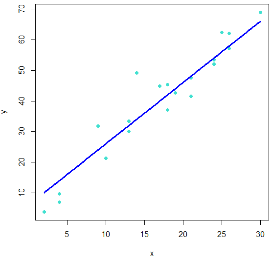
A scatter plot A scatter plot is a common data visualization tool used to display the relationship between two numerical variables.
In the example below we generate random data in the following way:
- We generate 20 random integers from 0 to 30, where duplicates are allowed
- For each number that we have generated in the first step, we multiply it by 2, add, 6, and finally add some Gaussian noise
A scatter plot of the data can then be created with the function plot(). We add in the example the graph of the function \(x\mapsto 2x+6\) to visualize the connection of the dataset and the line
R script
set.seed(123)
x <- sample(0:30, 20, replace = TRUE)
y <- 2*x + 6 + rnorm(length(x), mean = 0, sd = 6)

# Create the scatter plot
plot(x, y, pch = 16, col = "turquoise")
# add a line
curve(2*x+6, add = TRUE, col = "blue", lwd = 3)
Scatter plot with an added line

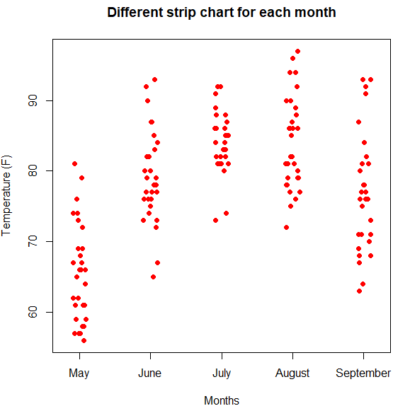
A strip chart with a formula A strip chart is a simple and effective way to visualize numerical data as a function of a categorical variable. The primary purpose of a strip chart is to show the distribution of data points and to identify pattern. Below we plot the recorded temperatures in New York during the months that data were collected and placed in the the airquality dataset in the datasets package.
R script
stripchart(Temp ~ Month, data = airquality,
  main = "Different strip chart for each month",
  xlab = "Months", ylab = "Temperature",
  group.names=c("May","June","July",
                "August","September"),
  col = "red", pch = 16,
  vertical = TRUE,
  method = "jitter"
)
With the method argument we specify the way coincident points are plotted like stacked or jitter. This allows us to enhance the visualization of points, especially when multiple data points have the same values and would otherwise overlap. For example, using method = "jitter" moves the points slightly to make them more visible. This helps to depict the data distribution and present any overlapping points more clearly.
Strip chart


