Basic skills in R: Basic graphics
 Quantile-Quantile plot
A Quantile-Quantile plot, better known as QQ-plot, is a scatter plot that is used to visually check the normality of a given sample. In case of near normality the points in the QQ-plot are close to a straight line. Actually these points have the sample quantiles and the theoretical quantiles (z-scores) for the normal distribution as coordinates.
Example of a nearly normally distributed sample
R script
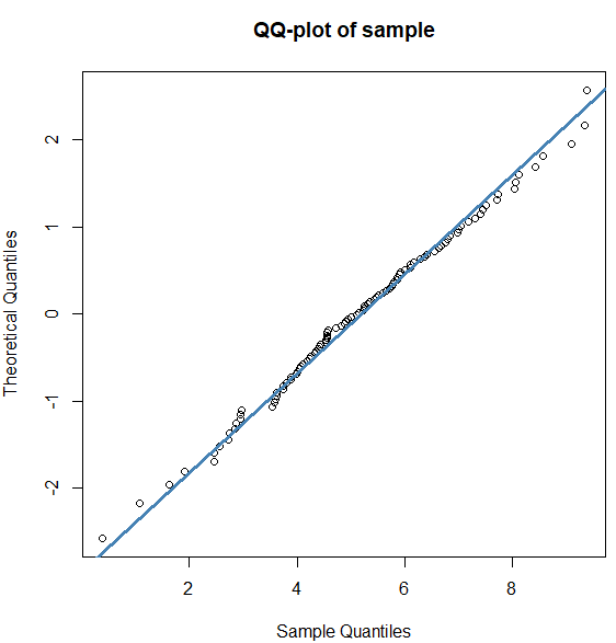
In the first example we create a sample of random numbers for the normal distribution with mean value 5 and standard deviation 2. With the function qqnorm() we create a QQ-plot of the sample values; the option datax = TRUE is used to let the sample quantiles be on the x-axis. With qqline() we add a reference line.
set.seed(123)
x <- rnorm(n = 100, mean = 5, sd = 2)
qqnorm(x, datax = TRUE, main = "QQ-plot of sample")
qqline(x, datax = TRUE, col = "steelblue", lwd = 3)
Normal QQ-plot
Example with the ToothGrowth dataset
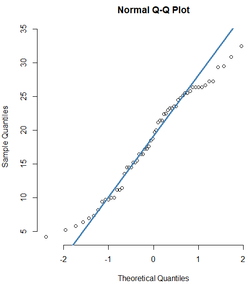
R has a built-in dataset ToothGrowth that contains the length of odontoblasts (cells responsible for tooth growth) in 60 guinea pigs that are part of a clinical study. We visually check the normalilty of the length data through the following script.
length <- ToothGrowth$len
qqnorm(length, frame = FALSE)
qqline(length, col = "steelblue", lwd = 3)
The diagram on the right-hand side shows that normality of the dataset is less good at the extreme sample quantiles.
Normal QQ-plot
QQ-plot for any distribution The function qqplot() allows you to create a QQ-plot for any distribution. Unlike the function qqnorm(), you have to provide two arguments: the first set of data and the second set of quantiles for the distribution.
Explanation and R script
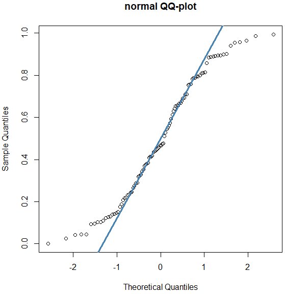
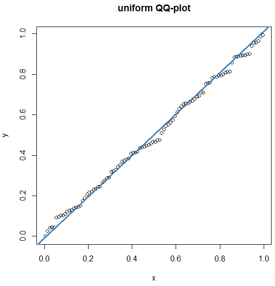
In our R script below, we first generate randomly values between \(0\) and \(1\) for the uniform distribution. A normal QQ-plot of the sample shows that the data are not normally distributed. The function ppoints() generates a particular number of probabilities or proportions. The function qunif() applied to set of proportions then returns the same number of quantiles from a uniform distribution for the given proportions. In a QQ-plot for the uniform distribution we see that the points are close to the reference line and that the generated dataset therefore is uniformly distributed.
set.seed(123)
n <- 100
y <- runif(n = n, min = 0, max = 1) # sample
x <- qunif(ppoints(n)) # theoretical quantiles

qqnorm(y, main="normal QQ-plot")
qqline(y, col = "steelblue", lwd = 3)

qqplot(x,y, main="uniform QQ-plot")
qqline(y, distribution = qunif,
       col = "steelblue", lwd = 3)
QQ-plots
