Basic skills in R: Basic graphics
 Combining plots
The painter's model of R leads to a special way of combining graphs: you use one high-level plotting functions, say the function plot(), to generate one of the graphs and you add other graphs by painting with low-level plotting functions like point() and lines().
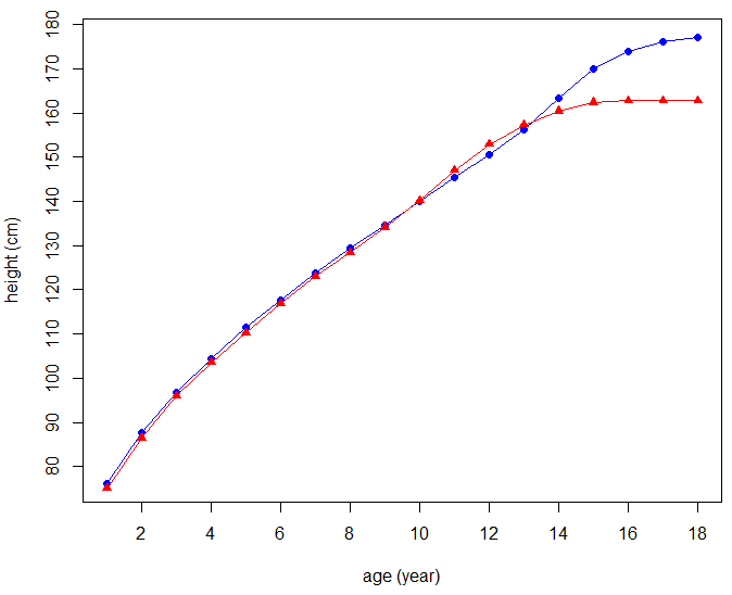
Example of human growth data We use human growth data about the average height of children in the Netherlands of Maroccon background from age 1 to 18 years.. Data come from the Dutch Growth Study 2010. We want to plot the two growth curves in one diagram with different colours and symbols for the data point, and we want to add a legend that identifies the two graph curves.
First we enter the data.
> age <- 1:18
> Height_boys <- c(76.1, 87.7, 96.8, 104.5, 111.4, 117.7, 123.9, 129.4, 134.6,
+                  140.1, 145.4, 150.5, 156.3, 163.3, 169.9, 174.0, 176.1, 177.2)
> Height_girls <- c(75.0, 86.5, 96.0, 103.5, 110.2, 116.8, 123.0, 128.4, 134.1,
+                   140.2, 147.0, 152.9, 157.3, 160.4, 162.4, 162.8, 162.8, 162.8)
Next, we plot the average height (in cm) of boys of Maroccon background against their age in blue and use a closed circle as symbol for a data points. The type of the plot is such that there is an overlay of lines and points.
> plot(x = age, y = Height_boys, xlab = "age (year)", ylab = "height (cm)",
+      type = "o", col = "blue", pch=16)
A plot will appear in a plot window. Via the low-level plotting function points() we can add the growth curve of girls of Maroccon background to the previously drawn plot window; here we select the red colour and a closed triangle as symbol for a data point. We draw no new labels on the axes.
> points(x = age, y = Height_girls, xlab = "", ylab = "", type = "o", col = "red", pch = 17)
With the function legend() we can add a legend at a specified location that explains the colours and symbols used.
> legend(1, 170, legend = c("boys", "girls"), col = c("blue", "red"), pch = c(16,17))
This leads to the following diagram:
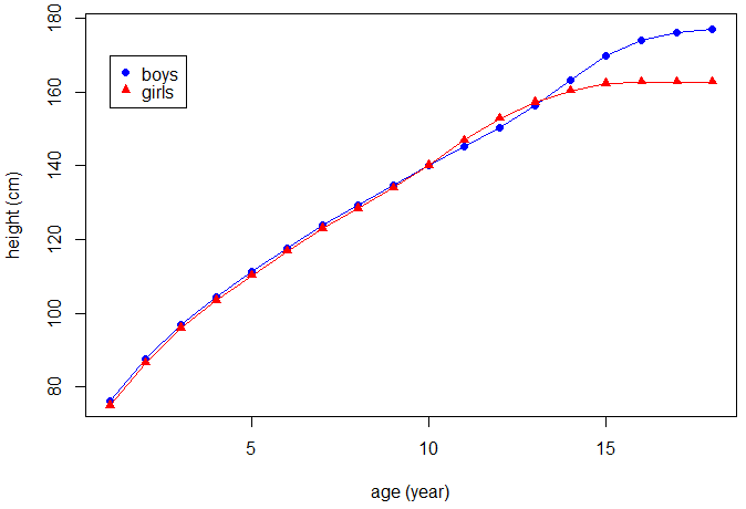
The location of the legend may also be specified by a single keyword from the list "bottomright", "bottom", "bottomleft", "left", "topleft", "top", "topright", "right", and "center".
Instead of using the low-level plotting function points(), we could have used the low-level plotting function lines().
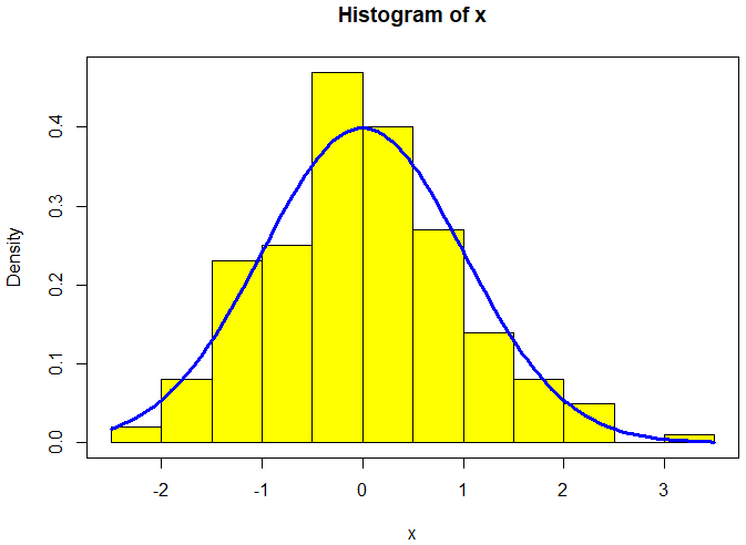
Example from statistics In this example, we generate 200 random numbers for the standard normal distribution and draw a histogram with relative frequency with a bin size implicitly based on the range of the data. For comparison reasons, we add the graph of the density function of the standard normal distribution to the diagram.
First, we use the function rnorm() to create a list of random numbers for the standard normal distribution.
> set.seed(123)   # set seed to ensure reproducibility
> x <- rnorm(200) # generate random numbers
Next, we construct the histogram of the set of random numbers but do not make a plot because we first want to compute the vertical range of out intended plot to ensure that everything will be visible.
> h <- hist(x, plot = FALSE)               # generate a histogram without plotting
> y_range <- range(0, h$density, dnorm(0)) # determine min and max of vertical range
We are ready to plot the intended histogram. The freq=FALSE argument to the function hist() ensures that the histogram is in terms of densities rather than absolute counts. We colour the bars in yellow.
> hist(x, freq = FALSE, ylim = y_range, col = "yellow")
We use the function curve() to add the graph of the density function of the normal distribution as a thick blue curve and put a box around the plot.
> curve(dnorm(x), add = TRUE, col = "blue", lwd = 3)
> box()
The following diagram has been created in this way:
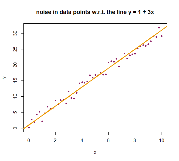
Combining points and lines We present an example in which we generate points on a straight line, but then add some noise. We plot the data point and draw the straight line that we used to generate the points
In R we can simulate noise by the function jitter().
jitter() has the following arguments:
x, a numeric vector in which the noise is simulated.factor, a multiplication factor for the strength of the noise. It is a positive values and equal to 1 by default.amount, an argument that determines the interval of the noise. Note: the argumentfactoris neglected when you use the argumentamount.
First, we create coordinates of points on the line \(y = 1 + 3x \) without any noise.
> x_values <- seq(from = 0, to = 10, by = 0.2)
> y_values <- 1 + 3*x_values
Now, we will define the noise. We adjust the argument amount in the function jitter() because it allows us to precisely control the range of the noise. We opt for a measurement error margin of 2 at the lower end and 2 at the upper end.
We will simulate noise only on the \(y\)-values because this is the response variable that is being measured. This is also the variable in which practical measurement errors are likely to occur and need correction.
With the function set.seed(), we ensure that the random number generator in R generates the same set of randomly drawn numbers each time. This provides us with reproducible simulations. The natural number 123 used in the code can be chosen as the starting point for a simulation.
> set.seed(123)
> noisy_values <- jitter(x = y_values, amount = 2)
We plot the data points and use the low-level plotting function abline() to add a straight line \(y=a+ b\,x\) to the diagram; we only have to specify the values of the \(y\)-intercept and the slope of the line.
> plot(x = x_values, y = noisy_values, xlab = "x", ylab = "y",
+      type = "p", pch = 20, col = "Maroon4",
+      main = "noise in data points w.r.t. the line y = 1 + 3x")
> abline(a = 1, b = 3, col = "Orange2", lwd = 3)  # add the line
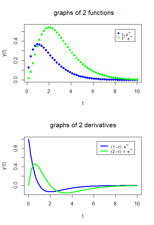
Combining graphs of functions In the following R script, the graphs of the functions \[f_1(t)=te^{-t},\quad f_2(t)=t^2e^{-t}\] are plotted in one diagram and the graphs of their first derivatives \[f_1'(t)=(1-t)te^{-t},\quad f_2'(t)=(2-t)te^{-t}\] are plotted in another diagram below. Together they form one figure. The R function that splits a figure into several parts is the following: par(mfrow=c(2,1)) fills \(2\) rows and \(1\) column with graphs. This time we have put the formulas in the legend in a more mathematical notation via the function expression().
# define the functions and their derivatives
f1  <- function(t) { t * exp(-t) }
f2  <- function(t) { t^2 * exp(-t) }
f1p <- function(t) { (1-t) * exp(-t) }
f2p <- function(t) { (2-t) * t * exp(-t) }

# create time intervals and function values
t <- seq(from=0, to=10, length=204)
tt <- t[seq(from=0, to=204, by=4)]
y1 <- f1(tt)
y2 <- f2(tt)
y1p <- f1p(t)
y2p <- f2p(t)

par(mfrow = c(2,1)) # 2 diagrams below each other

# upper diagram with graphs of functions
plot(tt, y1, type = "p", col = "blue", pch = 16, lwd = 3, ylim = c(0,0.55),
  main = "graphs of 2 functions", xlab = "t", ylab = "y(t)")
  points(tt, y2, type = "p", col = "green", pch = 17, lwd = 3)
  legend(8, 0.52, text.width = 1,
  legend = expression(t%.%e^-t,t^2%.%e^-t),
  col = c("blue", "green"), pch = c(16,17), cex = 0.8)
 # lower diagram with graphs of derivatives
 plot(t, y1p, type = "l", col = "blue", lwd = 3, ylim = c(-0.15,1),
   main = "graphs of 2 derivatives",
   xlab = "t", ylab = "y'(t)")
   lines(t, y2p, type = "l", col = "green", lwd = 3)
   legend(6.3, 0.95, text.width = 2,
   legend = expression((1-t)%.%e^-t, (2-t)%.%t%.%e^-t),
   col = c("blue", "green"), lwd = 3, cex = 0.8)
The result looks like this:
