2. Association and Correlation: Practical 2
 Visualising the Relationship Between Two Variables
Now that you are familiar with the data, you can start to inspect the relationship between the various variables. Recall from the theoretical part of the course, that the relationship between two variables can be described by direction, form and strength. The direction can be either positive or negative. A positive correlation between two variables indicates that if variable #X# increases, variable #Y# increases as well. A negative correlation indicates the opposite; if variable #X# increases, variable #Y# decreases.
Often, we have an idea about the direction of a correlation. For example, we might expect that hybrid cars with a higher acceleration rate are also more expensive. The first thing we should do when we have such an expectation is visualising the relationship between the variables. For categorical variables, we can do this through a contingency table and for numerical variables we use a scatterplot.
The generic function for plotting in R is the plot() function. Let's take a look at its documentation:
?plot
A scatterplot can thus be made with the plot(x, y) command. It is common to use the explanatory variable for the x-axis and the response variable on the y-axis. If we expect that the price of hybrid cars is influenced by the acceleration rate, the explanatory variable is the acceleration rate and the price is the response variable.
The plot function accepts many arguments to make our scatterplot nicer. Most important options are the 'main' for the title, 'xlab' and 'ylab' for a title respectively the x-axis and the y-axis. Note also the various options for 'type'. The default for type is 'p' for points, which is good for scatterplots. You will probably also often use the type 'l' for lines. You can find information about more options in the documentation for graphical parameters (?par).
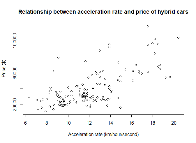
Is there any indication of a positive relationship between acceleration rate and price?
plot(hybrid$accelrate, hybrid$msrp, main = 'Relationship between acceleration rate and price of hybrid cars', xlab = 'Acceleration rate (km/hour/second)', ylab='Price ($)')

The scatterplots indicate indeed a positive relationship between the acceleration rate and the price of hybrid cars. The relationship seems approximately linear.
Besides using the plot function for variables, you can also use it to plot an entire (numerical) dataframe. This will create a pair plot, which is a matrix of scatterplots. Each cell of this matrix shows a scatterplot of two variables. You can find out which two variables by following the row and column to the diagonal where the variable names are displayed. A pair plot is very useful if you want to get a quick idea of the relationships between the variables in the dataframe.
Scatterplots only make sense for numerical variables (with an interval/ratio or ordinal measurement level). So we need to select these variables from the hybrid data set.
A look back into the introduction section (where the meaning of the 9 variables were explained) teaches us that carid, vehicle, carclass and carclass_id should be left out (these are respectively columns 1,2,8 and 9).
So the following command will do the job:
plot(hybrid[,3:7])

# alternative ways to select the right columns:
#
# hybrid_qvar <- hybrid[,c("year","msrp","accelrate","mpg","mpgmpge")]
# plot(hybrid_qvar)
#
# plot(hybrid[,-c(1,2,8,9)]  # the - sign leave out columns 1,2,8,9
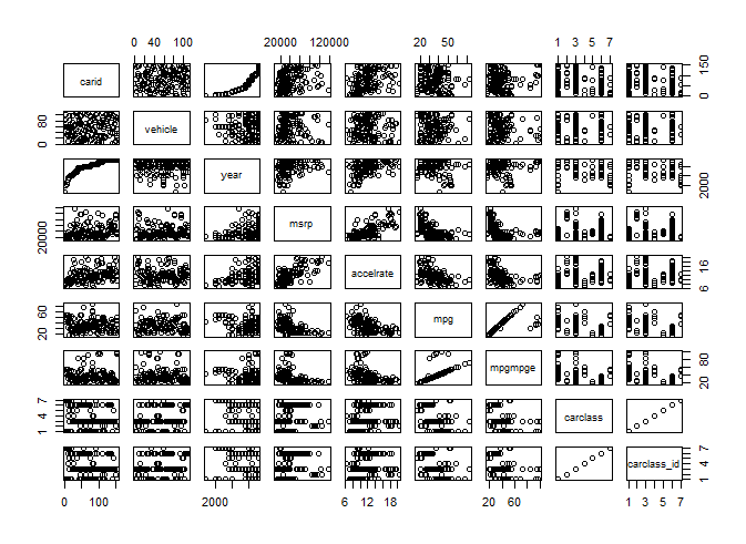
A sidenote: if you apply the plot command directly to the entire data frame, you will get a scatterplot matrix (and no error message or warning by R that you do in fact something silly).
plot(hybrid)

So how is it possible that we see categorical variables (and even a character variable) turn up as numbers in a scatter plot? This happens because R converts the data frame to a version with only numerical variables, using the function data.matrix( ). After that, it plots the results. As you can see in the result, relations between categorical data and other variables may seem interesting at first sight (e.g. carid vs year) but these are not meaningful: the data was initially ordered by year and the carid is just an incremental index that also reflect this ordering (because of this initial organization of the data).


