10. Categorical Association: Practical 10
 Cross Tables
Let's start by making a table and barplot of one of our variables, just like we did in practicum 3.
Make a barplot of the variable "unhappy".
Which category contains the least observations?
You can first check the table
table(WD$ unhappy)and then make a barplot of the table
barplot(table(WD$ unhappy))
A cross table shows the frequency distribution of two or more variables. This gives you insight into the relationship between two categorical variables. The underlying question is whether one or more categories or combinations of categories have a frequency that deviates from the overall pattern.
Make a cross table of the variables environment and butt.
t <- table(WD$ environment, WD$ butt)Combining all this information results in the following table:
r <- rowSums(t)
c <- colSums(t)
tot <- sum(t)
environment |
butt | |||
| yes | no | sum | ||
| strongly disagree | 1 | 0 | 1 | |
| disagree | 2 | 0 | 2 | |
| neutral | 5 | 12 | 17 | |
| agree | 83 | 34 | 117 | |
| strongly agree | 42 | 17 | 59 | |
| sum | 133 | 63 | 196 | |
In the grey areas at the top and left, the variables and the different categories that occur in these are given. The central (white) part of the table contains the joint frequencies. And the blue areas contain the frequency distributions for the individual variables. With 'deviating from the overall pattern' we mean that the distribution for the joint frequencies for one category (the distribution over one row) is very different from the distribution for the individual variable as a whole (the values in the blue margin at the bottom).
As you see, it is very hard to compare so many numbers to discern these kinds of patterns. Converting the frequencies into proportions helps, but is not ideal either.
The best way to search for relationships or patterns in a cross table is by visualising it via a so-called mosaic plot. We can create a mosaic plot with the command mosaicplot() .
observed <- table(WD$bath, WD$wash)
mosaicplot(observed,xlab='bath', ylab='wash')
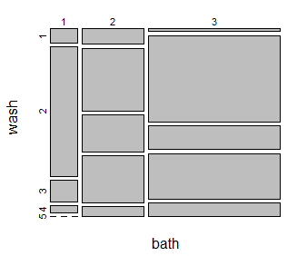
Figure 1 gives an example of a mosaic plot for the variables 'wash' and 'bath'.

Figure 1. Mosaic plot for the variables wash and bath in the WD dataframe.
The areas of the rectangles in a mosaic plot correspond to the number of occurrences for a specific combination of two categorical variables. In this specific example the relative height of the top left rectangle shows the share of the observations that have value 1 (strongly disagree) for the variable "wash", and its width shows the share of the observations that have value 1 (regularly) for the variable "bath".
The way to read a mosaic plot is by comparing columns (rows) among each other. If two categorical variables are related, it means that the distribution of cell sizes for one column (row) is quite different from the distribution of the other columns (row).


